
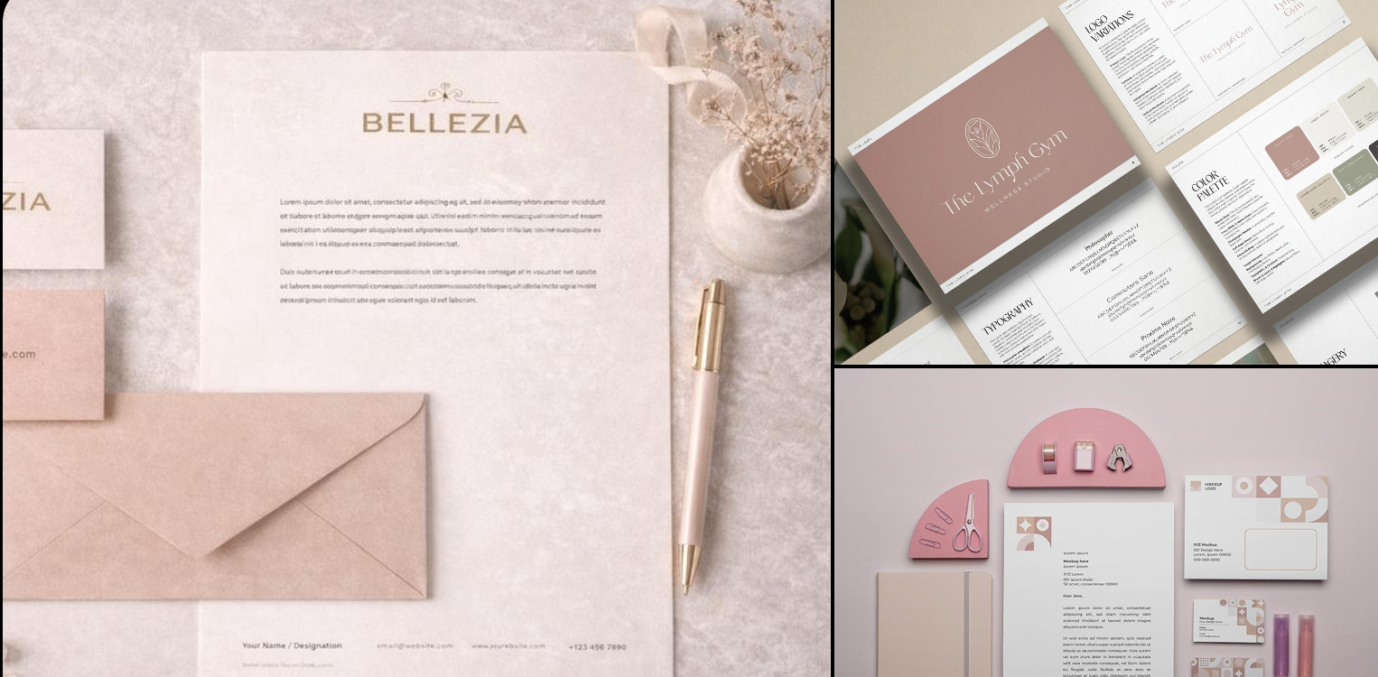
Have you ever wondered about the importance of brand colors and whether your business is losing potential customers because your branding fails to grab attention, build trust, or make you memorable?
Imagine two businesses offering exactly the same service, at the same price, with the same level of expertise.
One has a polished, cohesive visual identity. Its website, logo, social media graphics, and marketing materials feel connected. You immediately get a sense of what the business stands for.
The other uses random colors across its website, social media posts, and promotional materials. Nothing seems to connect. The business may be excellent, but its presentation doesn’t leave much of an impression.
Which business are you more likely to remember?
Your brand colors may seem like a small design decision. However, they play a much bigger role in how people perceive, recognize, and remember your business.
Colors aren’t just there to make your business look pretty. They’re part of how your brand communicates before you say a single word.
Whether you’re a coach, consultant, creative entrepreneur, wellness practitioner, handmade product seller, or service provider, choosing the right brand colors can help you create a more recognizable and memorable business.
Let’s explore why your brand colors matter, what they communicate, and how to choose colors that make your business stand out for the right reasons.
Why Brand Colors Matter More Than You Think
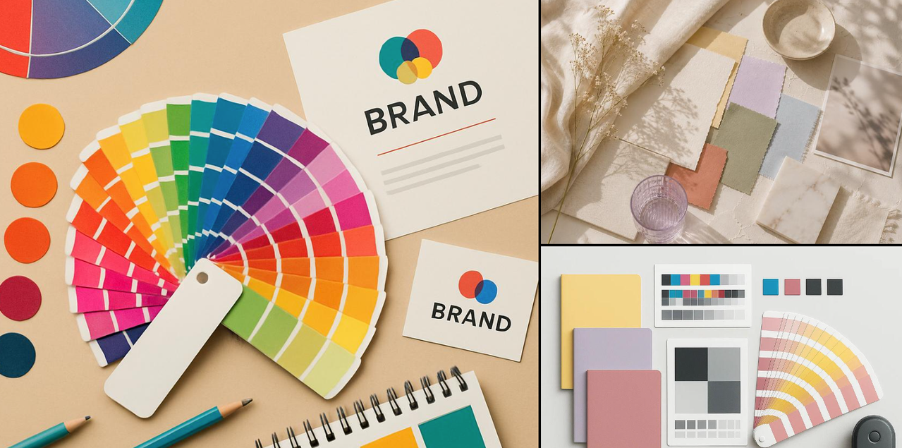
When someone visits your website, scrolls through your social media profile, or sees your promotional graphic, they begin forming impressions of your business almost immediately.
They may not consciously analyze your colors, but the overall visual experience can influence whether your brand feels:
- Professional or amateurish
- Calm or energetic
- Premium or affordable
- Modern or traditional
- Trustworthy or uncertain
- Memorable or ordinary
Color is one of the visual elements that contributes to these impressions.
Research into marketing and brand perception has found that color can influence how consumers perceive brand personality, familiarity, likability, and brand image. This means your color choices are not simply decorative. They can help shape the way people interpret your business.
Think of your brand colors as your business’s visual voice. Your words tell people what you do, while your colors help set the mood for how they experience it.
And when both work together, your brand becomes more powerful.
Recommended Read: How to Start Branding Your Business as a Woman Entrepreneur
1. Your Brand Colors Create Your First Impression
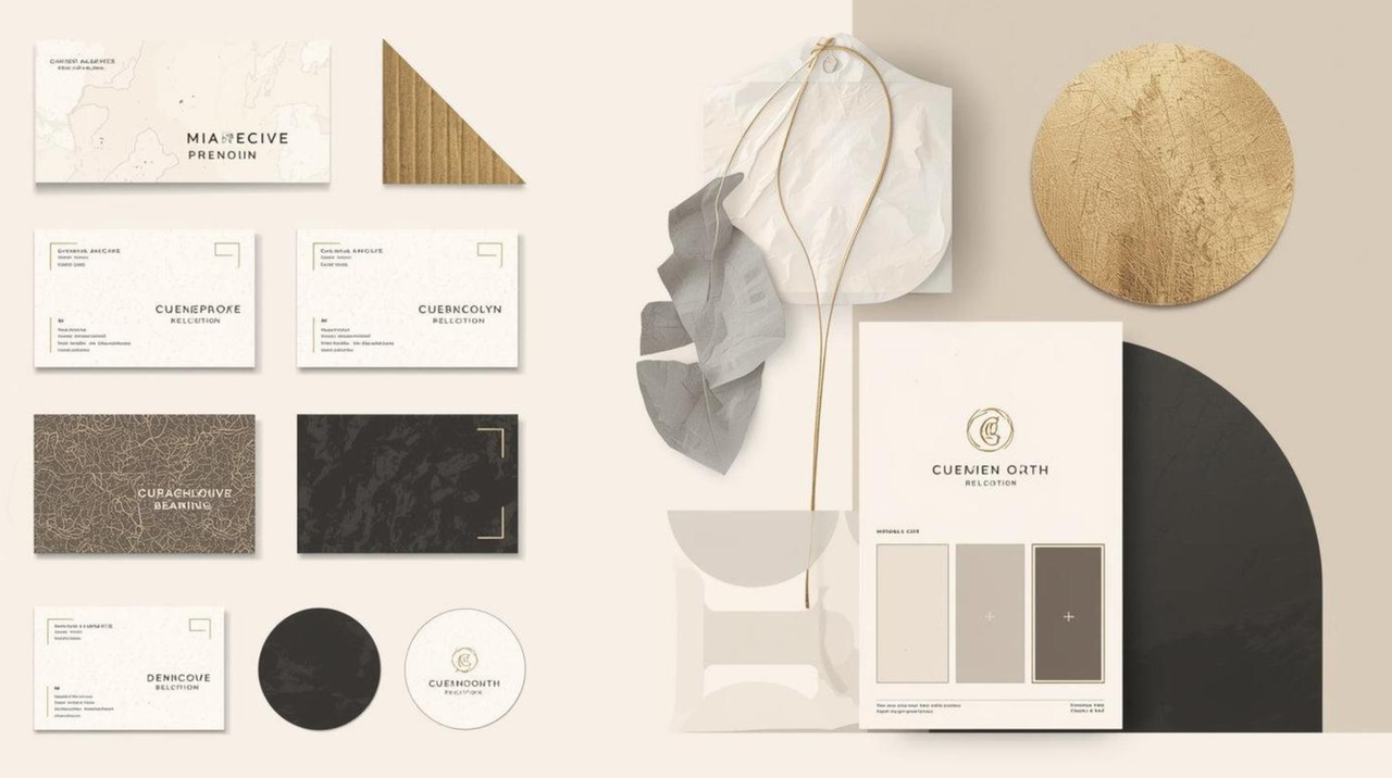
You only get one chance to make a first impression, right? While people may take time to understand your services, expertise, or personality, your visual presentation is something they experience right away.
Imagine landing on a website for a Reiki practitioner.
The website uses soft lavender, muted pink, warm cream, and delicate natural imagery. The overall design feels peaceful, gentle, and welcoming.
Now imagine the same website using bright neon red, sharp black, and high-energy yellow throughout.
Neither color combination is inherently bad. However, the second combination might not immediately communicate the peaceful, nurturing experience a visitor expects from a Reiki practitioner.
This is where color becomes strategic.
Your colors should support the experience you want people to associate with your business.
Ask yourself:
- What do I want someone to feel when they first visit my website?
- Does my visual presentation reflect the experience I offer?
- Do my colors communicate the personality of my business?
Your first impression should feel like an introduction to your brand, not a completely different personality.
2. Brand Colors Help People Recognize Your Business
Have you ever recognized a brand simply because you saw its colors, even before reading its name?
That is the power of consistent visual identity.
When you repeatedly use the same colors across your website, social media posts, email graphics, packaging, business cards, and marketing materials, you create visual familiarity.
Over time, people may begin associating those colors with your business.
For example, imagine you regularly publish content using a consistent combination of dusty rose, mauve, and cream. Someone sees your Pinterest pin today, your Instagram post next week, and your website a few days later.
Because your visual identity remains consistent, those different pieces of content begin to feel connected.
Your brand gradually becomes easier to recognize.
This doesn’t happen overnight. Recognition builds through repeated exposure and consistent presentation.
Consistency is what turns a collection of pretty designs into a recognizable brand.
3. Your Colors Communicate Your Brand Personality
Every business has a personality, even if its owner hasn’t deliberately defined one.
Your business might be:
- Friendly and approachable
- Bold and adventurous
- Calm and nurturing
- Elegant and luxurious
- Playful and creative
- Practical and dependable
- Modern and innovative
Your colors can help communicate these qualities visually.
For instance, a business that wants to feel luxurious may choose deep, rich colors, understated neutrals, and restrained accents. A brand that wants to feel cheerful and approachable may use brighter, more energetic colors.
However, the shade, saturation, brightness, combination, and surrounding design elements all matter.
A soft pastel blue may feel peaceful and gentle, while a vibrant electric blue may feel energetic and modern.
The color itself is only part of the story. How you use it matters just as much.
What personality could different colors communicate?
Here are some common associations to use as inspiration when thinking about your brand.
| Color | Common associations | Potential brand personality |
|---|---|---|
| Blue | Trust, stability, calm, dependability | Professional, reliable, reassuring |
| Red | Energy, passion, urgency, excitement | Bold, confident, dynamic |
| Yellow | Optimism, happiness, warmth | Cheerful, friendly, uplifting |
| Green | Nature, growth, freshness, balance | Sustainable, healthy, grounded |
| Purple | Creativity, spirituality, mystery, luxury | Imaginative, expressive, sophisticated |
| Pink | Warmth, compassion, playfulness, romance | Caring, feminine, youthful |
| Orange | Enthusiasm, friendliness, vitality | Energetic, approachable, adventurous |
| Black | Elegance, power, sophistication | Premium, refined, confident |
| White | Simplicity, clarity, purity | Clean, minimal, fresh |
| Brown | Earthiness, comfort, authenticity | Natural, grounded, dependable |
Remember, these are common associations, not universal rules. A brand can use blue and still feel adventurous, or use pink and still feel bold and professional.
The key is choosing colors that work together to communicate the personality you want.
4. The Wrong Colors Can Confuse Your Audience
You may have beautiful colors. You may even love your logo.
But are your colors helping people understand your business?
Imagine a financial consultant using a chaotic combination of fluorescent pink, bright orange, lime green, and several competing shades.
The colors might be fun, but if the consultant wants to communicate confidence, professionalism, stability, and clarity, the visual presentation could be working against the intended message.
Likewise, a children’s entertainment brand using only muted gray and beige might feel too serious or subdued for its audience.
This doesn’t mean you must follow industry conventions. In fact, using unexpected colors can help your business stand out.
However, there should be a reason behind your choices.
Your color palette should support your brand personality, your audience, and your positioning, not contradict them without purpose.
5. Brand Colors Help You Stand Out From Competitors
Take a look at businesses in your niche.
Do most of them use blue? Are they all using neutral beige? Does every wellness brand seem to use sage green and white?
Industry conventions can be useful because they help customers understand what type of business they’re looking at. However, if every business looks almost identical, it becomes harder for any one brand to stand out.
This is an opportunity to be different.
You don’t necessarily have to abandon the colors commonly used in your industry. You can create distinction through:
- A different shade of a familiar color
- An unexpected accent color
- A unique combination of colors
- A distinctive balance of light and dark
- A consistent visual style
- A recognizable way of applying your colors
For example, if most wellness brands use sage green and white, you might explore warm terracotta, muted plum, soft peach, or a rich botanical palette.
Your goal isn’t to be different just for the sake of being different.
It’s to create a brand that feels appropriate to your audience while giving people a reason to remember you.
6. Colors Can Influence How Customers Perceive Your Products and Services
Your colors can influence the way customers interpret what you’re offering.
A premium product presented in an elegant, restrained palette may feel very different from the same product presented in a playful, brightly colored design.
A business selling handmade candles might use warm neutrals, earthy tones, and subtle gold accents to communicate relaxation and luxury.
A fitness coach might use bold colors and strong contrast to communicate energy, movement, and motivation.
A children’s art business might use a lively palette to communicate imagination and fun.
Color also interacts with the product or service itself. A palette that feels appropriate for one type of business may not work for another.
The important thing is to create visual harmony between:
- What you sell
- Who you sell it to
- How you want customers to perceive it
- The experience your brand promises
Your visual identity should reinforce the value of your offering.
7. Your Brand Colors Build Consistency Across Your Marketing
Imagine creating a new social media post every day.
Today you use purple. Tomorrow you use turquoise. The next day you choose bright red because it looks nice with the photograph. Your website uses a different palette, and your email graphics look completely unrelated.
Each design might look attractive individually, but together they don’t create a recognizable identity.
A defined brand palette solves this problem.
Once you choose your colors, you can use them consistently across:
- Your website
- Social media posts
- Pinterest pins
- Email newsletters
- Lead magnets and PDFs
- Business cards
- Product packaging
- Presentations
- Promotional materials
This also makes designing content easier.
Instead of starting from scratch and wondering which colors to use every time, you have a ready-made visual framework.
Less decision-making. More consistency. A brand that looks like it knows what it’s doing.
Not sure what style best represents your business?
Discover your unique brand personality and get a personalized Brand Style Report to help you create a brand that reflects your vision, connects with your audience, and stands out.
Click Here to Take the Free Brand Personality Quiz and discover your brand style today!
How to Choose Brand Colors That Represent Your Business
Choosing brand colors shouldn’t begin with opening a color picker and selecting your five favorite shades.
Start with your business.
Step 1: Define Your Brand Personality
Choose three to five words that describe how you want your business to be perceived.
For example:
- Calm
- Trustworthy
- Creative
- Sophisticated
- Energetic
- Compassionate
- Modern
- Playful
- Natural
- Luxurious
These words become your guide.
If you want your brand to feel calm, playful, and nurturing, your choices may be very different from a brand that wants to feel bold, sophisticated, and powerful.
Step 2: Understand Your Ideal Customer
Who are you trying to attract?
Think about their age range, interests, preferences, expectations, lifestyle, and the kind of experience they are looking for.
A brand targeting young creatives may use a very different visual style from a brand targeting corporate executives.
Your colors should appeal to the people you want to connect with, not just reflect your personal taste.
Step 3: Explore Color Associations
Use color psychology as a starting point.
Explore how different colors are commonly associated with emotions, qualities, and experiences. Then consider whether those associations align with your brand personality.
Don’t treat color charts as rigid rules. Use them to generate ideas and possibilities.
Step 4: Choose Your Core Palette
A simple brand palette often includes a few roles:
Primary color: Your main brand color. This is often the most recognizable color in your visual identity.
Secondary color: Supports the primary color and adds variety.
Accent color: Used sparingly to highlight important elements such as buttons, offers, or key details.
Neutral colors: Used for backgrounds, text, and balance. Examples include cream, white, charcoal, gray, and beige.
You don’t need ten different colors. A carefully selected palette of four to six colors is often plenty.
Step 5: Test Your Colors Together
Never choose colors only by looking at individual swatches.
Put them together and test them in real designs.
Create a sample:
- Website homepage
- Social media post
- Business card
- Promotional graphic
Check whether the colors feel harmonious, whether important elements stand out, and whether the text is easy to read.
A color that looks gorgeous on its own may not work as well when paired with the rest of your palette.
9. Common Mistakes Businesses Make When Choosing Colors
Even a business with great products and services can make avoidable branding mistakes.
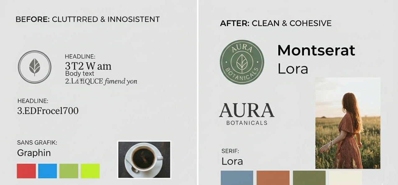
Choosing colors only because you love them
Your favorite color isn’t automatically the right brand color. It needs to fit your business, audience, and brand personality.
Using too many colors
When everything is colorful, nothing stands out. Too many competing colors can make your brand feel visually chaotic.
Following trends blindly
Trendy colors may look fresh today, but your brand should have a visual identity that can grow with your business.
Copying another brand
You may love another business’s branding, but copying its palette won’t give your business its own identity.
Use other brands for inspiration, not imitation.
Ignoring readability and contrast
Beautiful colors are useless if people can’t read your website text, buttons, or graphics.
Make sure your text is easy to read, especially for people with visual difficulties. Check contrast between text and background, and don’t rely on color alone to communicate important information.
Using different colors everywhere
Your website, social media, and marketing materials should feel like parts of the same brand.
Consistency creates familiarity. Constantly changing colors creates confusion.
Not sure what style best represents your business?
Discover your unique brand personality and get a personalized Brand Style Report to help you create a brand that reflects your vision, connects with your audience, and stands out.
Click Here to Take the Free Brand Personality Quiz and discover your brand style today!
10. Examples of Brand Color Palettes for Different Business Niches
Need some inspiration? Here are a few color directions to explore.
Wellness and Reiki Business
Personality: Calm, nurturing, spiritual, peaceful
Palette idea: Lavender, dusty pink, warm cream, muted plum.
Coaching and Consulting
Personality: Confident, professional, supportive, trustworthy
Palette idea: Deep navy, muted teal, warm white, soft gold.
Handmade Products and Crafts
Personality: Creative, authentic, warm, personal
Palette idea: Terracotta, sage, mustard, warm beige.
Beauty and Skincare
Personality: Elegant, fresh, luxurious, clean
Palette idea: Soft blush, ivory, muted rose, champagne.
Digital Marketing and Technology
Personality: Modern, innovative, capable, energetic
Palette idea: Deep blue, electric teal, lavender, cool white.
These are starting points, not prescriptions. The best palette will depend on your positioning, your customers, your products, and the personality you want to express.
11. How to Know If Your Brand Colors Are Working
Once you’ve chosen your palette, don’t simply assume it’s perfect. Put it to work and evaluate it.
Ask yourself:
- Does my brand look consistent across platforms?
- Can people recognize my content?
- Do my colors reflect the personality of my business?
- Does my website look professional and cohesive?
- Are my colors appropriate for my target audience?
- Do my designs stand out without looking chaotic?
- Is everything easy to read?
- Does my visual identity look different from my competitors?
You can also ask a few people in your target audience to look at your branding.
Instead of asking, “Do you like these colors?” ask:
- What kind of business do you think this is?
- What three words come to mind when you see it?
- What kind of experience would you expect from this brand?
- Who do you think this business is trying to attract?
Their answers may reveal whether your colors are communicating what you intended.
Frequently Asked Questions About Brand Colors
Do brand colors really affect customer buying decisions?
Brand colors can influence perceptions, emotional responses, brand image, and judgments about products or services. However, they are only one part of the buying decision. Price, quality, customer experience, reputation, messaging, and customer needs all matter.
How many colors should a business have?
A business can start with four to six carefully selected colors: one primary color, one or two supporting colors, an accent color, and a few neutrals. The exact number depends on the brand and how the palette is used.
Should I change my brand colors if I don’t like them anymore?
Not necessarily. First, determine whether the colors are genuinely creating a problem or whether you’re simply tired of seeing them.
If your palette no longer reflects your business, attracts your intended audience, or supports your current positioning, a refresh may be worthwhile. However, consider how existing customers recognize your brand before making a dramatic change.
Can I use my favorite color as my brand color?
Absolutely! Your favorite color can be a great starting point. However, explore different shades and combinations to make sure it works with your brand personality, audience, and overall visual identity.
Which color is best for attracting customers?
There is no single color that attracts every customer or works for every business. The right colors depend on your audience, industry, brand personality, context, and the experience you want to communicate.
Do I need different brand colors for different social media platforms?
No. Ideally, your core brand colors remain consistent across platforms. You can adapt layouts, image styles, and color combinations for different content formats while maintaining your recognizable visual identity.
Your Brand Colors Are More Than Decoration
Your business may offer exceptional products, wonderful services, and years of expertise. But when your visual identity doesn’t reflect those qualities, potential customers may not see the value you’re offering.
Your brand colors are part of the story you tell.
They help set expectations, communicate personality, create visual consistency, distinguish you from competitors, and make your business easier to recognize.
You don’t need the loudest colors. You don’t need to follow every design trend. And you certainly don’t need to use the same palette as every other business in your niche.
You need colors that feel right for your brand, speak to your audience, and work together to create a recognizable identity.
Because the goal isn’t simply to make your business look beautiful.
The goal is to make it beautiful, meaningful, recognizable, and memorable.
And when your visual identity supports your business message, you give people one more reason to notice you, connect with you, and remember you.
Ready to make your business more memorable? Start by taking a fresh look at your brand colors. Do they tell the story you want your customers to hear or is it time for a brand refresh?
Check what style best represents your business?
Discover your unique brand personality and get a personalized Brand Style Report to help you create a brand that reflects your vision, connects with your audience, and stands out.
Click Here to Take the Free Brand Personality Quiz and discover your brand style today!

