
Have you ever wondered why some businesses look instantly recognizable and professional, while others seem to disappear into the crowd?
The answer may have more to do with their colors than you think.
The signs your brand colors are wrong aren’t always obvious. Your colors may look attractive individually, but together they might be confusing your audience, failing to communicate your personality, or making your business look different from the experience you actually offer.
Think about it. You could be offering an amazing product or service, creating helpful content, and working hard to attract customers but your visual branding might be quietly working against you.
Your brand colors are often one of the first things people notice. Before they read your About page, explore your services, or decide whether to trust you, they have already formed a visual impression.
So, how do you know whether your brand colors are helping your business or hurting it?
Let’s look at seven signs worth checking.
1. Your Brand Looks Different Everywhere
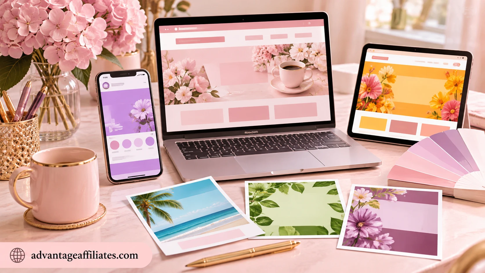
Do your Facebook posts look one way, your website another, and your promotional graphics like they belong to three completely different businesses?
This is one of the most common signs your brand colors are wrong—or simply not being used consistently.
Maybe you use pink in one design, purple in another, bright orange in your next promotional post, and a completely different shade every time you create something new.
There’s nothing wrong with experimenting with colors. However, when your audience sees a different visual identity every time, it becomes harder for them to connect those designs with your business.
Consistency helps people recognize your brand without needing to read your business name.
What you can do:
Choose a small, defined color palette and stick to it across your website, social media posts, email graphics, product packaging, and other marketing materials.
Your brand doesn’t need a new look every Monday. It needs a look people remember.
2. Your Colors Don’t Reflect Your Brand Personality

Imagine a wellness coach whose business is all about calm, balance, relaxation, and emotional wellbeing—but her branding uses aggressive neon colors, sharp contrasts, and a chaotic combination of shades.
Or imagine a luxury skincare brand using colors that feel childish, overly playful, or inexpensive.
The problem isn’t that those colors are inherently bad. The problem is that they may not communicate the experience the business wants customers to feel.
Your brand colors should support your brand personality.
Are you trying to appear:
-
Calm and nurturing?
-
Bold and confident?
-
Elegant and luxurious?
-
Friendly and approachable?
-
Creative and playful?
-
Modern and professional?
Your colors should help tell that story before you even say a word.
What you can do:
Take a step back and ask yourself, “If my brand were a person, what would its personality be?”
Then compare that personality with your current colors. Do they match—or are they telling two completely different stories?
3. Your Brand Is Difficult to Recognize

Have you ever scrolled through social media and instantly recognized a brand before seeing its name?
That’s the power of visual recognition.
When your brand colors remain consistent, people begin associating those colors with your business. Over time, your posts, website, graphics, and other materials become easier to recognize.
However, if you constantly change your palette, use random colors, or follow every new design trend, you may be missing the opportunity to build that recognition.
Your colors don’t have to be extraordinary. They need to be distinctive enough to become associated with you.
What you can do:
Use your primary brand colors consistently in recurring visual elements such as:
-
Social media templates
-
Website headings and buttons
-
Your logo and graphics
-
Email newsletters
-
Digital products
-
Promotional materials
The goal is to create a familiar visual pattern. When people see your content, you want them to think, “Oh, that’s her brand!”
4. Your Branding Doesn’t Attract Your Ideal Customers
Your colors may look beautiful to you—but are they attracting the people you actually want to reach?
For example, a business serving corporate clients may want to communicate trust, expertise, and professionalism. However, a color palette that feels overly playful or chaotic might not support that message.
On the other hand, a creative business targeting young, expressive customers may feel too rigid or serious if its colors are overly formal.
This doesn’t mean you must follow strict color rules for every industry. It means you should think about the people you’re trying to attract and the impression you want them to have.
Your brand colors should appeal to your ideal audience while still feeling authentic to you.
What you can do:
Before choosing or changing your colors, think about your ideal customer:
-
Who are they?
-
What do they value?
-
What kind of brands do they naturally connect with?
-
What feelings would make them comfortable choosing your business?
Choosing colors with your audience in mind is much more strategic than simply selecting your personal favorite shades.
5. Your Graphics Look Cluttered or Difficult to Read

Do your social media graphics look busy? Do text, backgrounds, buttons, and decorative elements compete for attention?
Sometimes the problem isn’t the design itself. It may be the number of colors you’re using or how those colors interact.
Too many competing shades can make a graphic feel chaotic. Low contrast can make important text difficult to read. Similar shades placed together may cause headings, buttons, or other elements to disappear visually.
A beautiful graphic isn’t necessarily an effective graphic.
Your audience should be able to understand the most important message without having to work hard to find it.
What you can do:
Simplify your color palette. Use a dominant color, one or two supporting colors, an accent shade for important elements, and neutral colors to give your design breathing room.
Also, pay attention to contrast. Dark text on a light background or light text on a dark background is generally easier to read when the contrast is strong enough.
Less visual noise often makes your message more powerful.
6. You Keep Changing Your Brand Colors
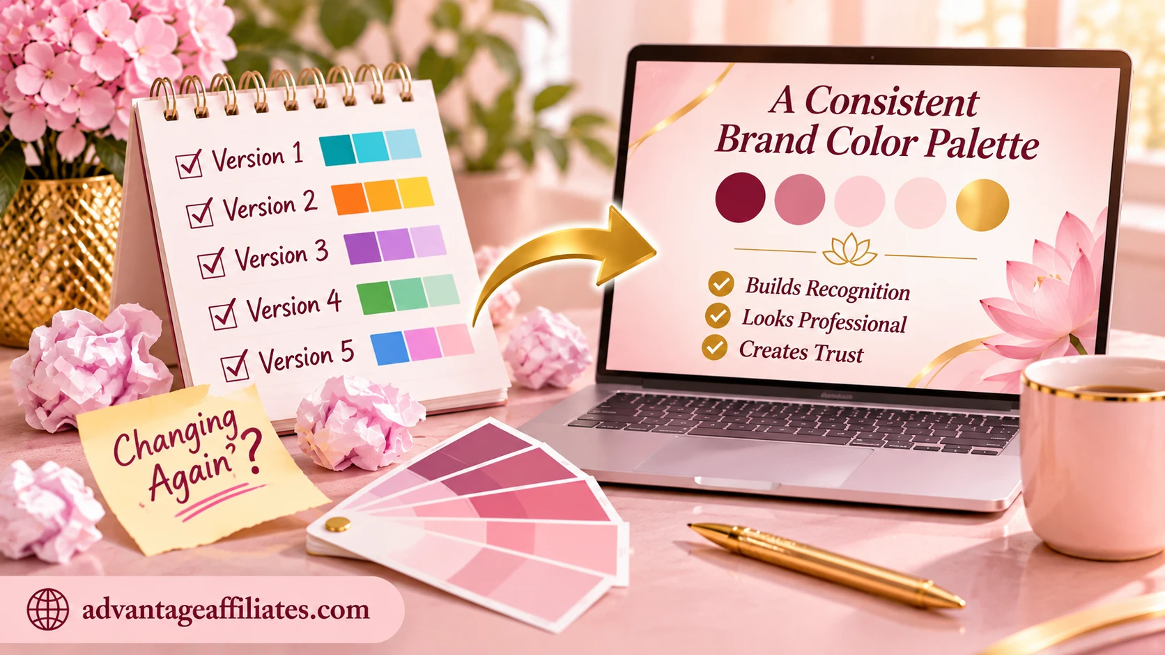
First you love beige. Then you discover lavender. A few days later, you’re obsessed with sage green. Then Pinterest introduces you to a gorgeous terracotta palette, and suddenly your entire brand needs a makeover.
Sound familiar?
If you’re constantly changing your brand colors, you may not have a clear understanding of your brand personality, your audience, or the visual direction you want to establish.
Of course, your brand can evolve. Updating your branding isn’t a crime, and sometimes a refresh is exactly what your business needs.
However, repeatedly changing colors without a clear reason can lead to inconsistency, wasted time, and a brand identity that never gets a chance to become recognizable.
What you can do:
Instead of choosing colors based on the latest trend, create a brand color palette based on your brand personality, audience, values, and business goals.
Give your palette time to work. Use it consistently across your marketing before deciding that it needs another makeover.
Your brand colors shouldn’t change every time Pinterest serves you a pretty new palette. (Pinterest is innocent—but very persuasive!)
7. Your Brand Doesn’t Feel Memorable
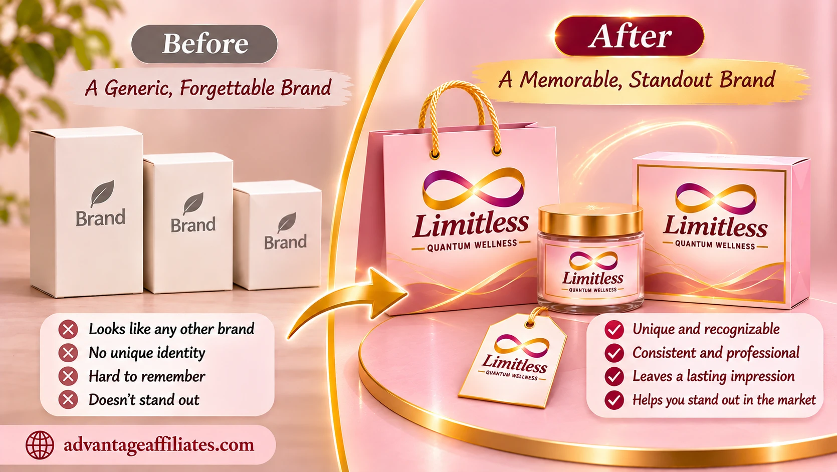
This is perhaps the biggest sign of all.
Your branding may look perfectly fine. Your colors may be attractive. Your graphics may be professionally designed.
But when someone visits your website or sees your social media content, does anything about your brand stay with them?
A memorable brand isn’t created by choosing the prettiest colors. It’s created by building a recognizable identity that communicates a clear personality and consistently connects with the right audience.
Your colors play an important role in that process.
When your palette reflects your personality, works well together, appeals to your ideal customers, and is used consistently, it helps create a visual identity that people can begin to remember.
What you can do:
Look at your branding as a whole—not just individual colors.
Ask yourself:
-
Do my colors reflect my business personality?
-
Do they appeal to my ideal customers?
-
Are they consistent across all my platforms?
-
Do they make my business look recognizable?
-
Do they create the feeling I want people to associate with my brand?
If you’re unsure about the answers, it may be time to rethink your color strategy.
How to Fix Your Brand Colors Without Starting From Scratch
If you recognized yourself in one or more of these signs, don’t panic. You don’t necessarily need to throw away your logo, redesign your website, or change everything overnight.
Start with a simple brand color review.
Step 1: Identify your brand personality
Decide what you want your business to communicate. Think about three to five words that describe your brand.
Step 2: Understand your ideal audience
Choose colors with the people you want to attract in mind, not only your personal preferences.
Step 3: Create a cohesive color palette
Build a palette with a primary color, supporting colors, accent color, and neutrals.
Step 4: Test your palette
Try your colors on social media graphics, your website, your logo, and marketing materials. See whether they work together.
Step 5: Be consistent
Once you’re happy with your palette, use it consistently. Recognition takes time, so don’t change everything again next week.
If you’d like to explore this in more detail, read my guide on the importance of brand colors and discover how the right colors can influence customer perception, brand recognition, and the way people remember your business.
Final Thoughts: Are Your Brand Colors Helping or Hurting You?
Your brand colors are more than decorative choices. They help communicate your personality, influence first impressions, create consistency, and make your business easier to recognize.
If your colors feel disconnected, inconsistent, difficult to work with, or simply don’t represent the business you’re building, it may be time to make a change.
You don’t need to be a professional designer to create a brand that looks beautiful and feels right. You simply need to understand your brand first—and let your visual identity follow.
And if you’re not quite sure what your brand personality is yet, start there.
Discover Your Brand Personality
Your colors should reflect who you are, what your business stands for, and the people you want to connect with.
Take my FREE Brand Personality Quiz and discover your unique brand style. You’ll receive a personalized Brand Style Report to help you understand your brand personality and create a visual identity that feels more aligned with your business.
Take the Free Brand Personality Quiz Here
Because your business deserves to be remembered, not just seen.

