
Have you ever seen a business’s colors and immediately thought, “That feels like them”? That is the power of a thoughtful color palette. If you’re wondering how to choose brand colors for your small business, the answer is about more than picking shades you personally like. Your colors should reflect your brand personality, connect with your ideal customers, help you stand out, and work consistently across your website, social media, packaging, and marketing.

You don’t need a design degree—or 27 shades of pink—to get started. Let’s build a brand color palette step by step.
1. Start With Your Brand Personality
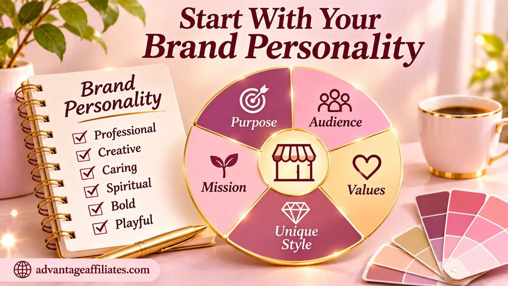
Before browsing color palettes, decide how you want your business to feel. Imagine a customer meeting your brand for the first time. What impression should they get?
Choose three to five words that describe your brand. For example:
- Calm, caring, and supportive
- Bold, energetic, and adventurous
- Premium, elegant, and refined
- Friendly, playful, and approachable
- Modern, innovative, and confident
These words become your color-selection compass. If you want your brand to feel calm and reassuring, a palette full of harsh, high-energy colors may not tell the right story. On the other hand, if you run a lively kids’ activity business, overly muted colors might make your brand feel less playful than it really is.
Quick exercise: Write down three words you want people to associate with your business. Keep them nearby as you make color decisions.
2. Think About Your Ideal Customer

Your colors aren’t just for you, they’re also part of the experience your customers have with your business.
Think about who you want to attract. What might appeal to them? What visual style feels relevant to their needs and expectations? A business serving busy professionals may want a clean, confident look. A handmade gift business may lean toward warmth, creativity, and personality.
Avoid treating color meanings as universal rules. People interpret colors through culture, personal experience, context, and combinations. Use common color associations as inspiration, then consider your audience and the message you want to communicate.
Ask yourself:
- Who is my ideal customer?
- What qualities might they value in a business like mine?
- What should my brand make them feel?
- Would my colors feel relevant to them?
3. Research Your Competitors: Then Find Your Own Look

Take a look at businesses in your niche. Notice which colors appear again and again. This can help you understand the visual expectations in your market—but it can also reveal an opportunity to stand out.
For example, if most local fitness businesses use black and red, you might explore a different combination that still feels energetic and professional. If many beauty brands use pale pink, you could use a deeper rose, warm neutrals, or an unexpected accent to create a distinct look.
Don’t copy another business’s palette. Use competitor research to spot patterns and make a deliberate choice about how your brand can be recognizable.
4. Choose One Primary Brand Color
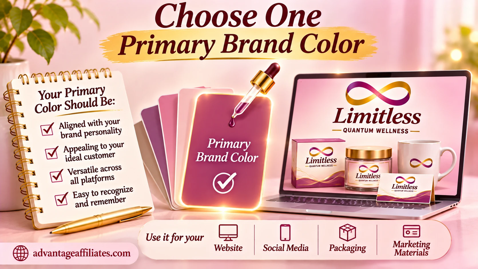
Your primary color is the shade most strongly associated with your business. It often appears in your logo, important website elements, social graphics, and other key brand touchpoints.
Choose a color that supports your brand personality and audience—not just the shade that’s trending this month.
A few starting associations to explore:
- Blue: often associated with trust, calm, and dependability
- Green: often connected with nature, growth, and wellbeing
- Yellow: can feel bright, optimistic, and energetic
- Red: can communicate passion, urgency, or excitement
- Purple: may suggest creativity, luxury, or imagination
- Pink: can feel warm, playful, gentle, or expressive
- Orange: often feels energetic, friendly, and creative
These are starting points, not fixed rules. The shade, surrounding colors, design, and audience all change the overall impression.
5. Build a Small, Balanced Brand Color Palette
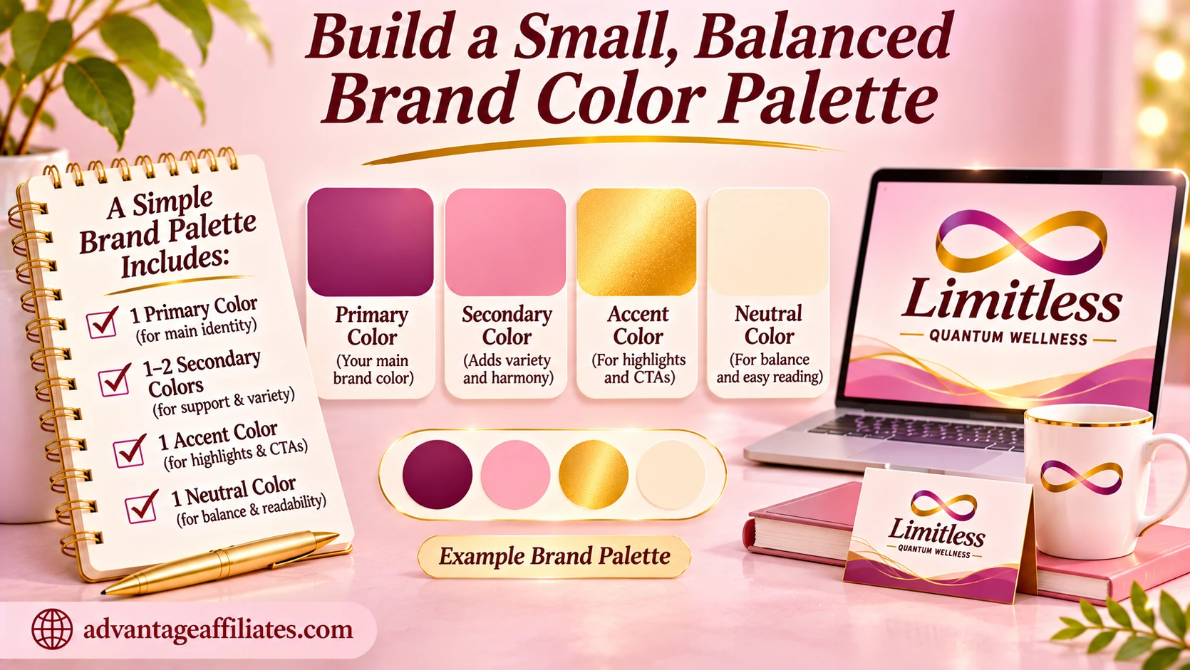
Once you’ve selected your primary color, build a supporting palette around it. You don’t need a rainbow of colors competing for attention.
A beginner-friendly palette might include:
- Primary: your signature brand color
- Secondary: one supporting color that complements the primary
- Accent: a contrasting shade for highlights, buttons, or special details
- Light neutral: for backgrounds and breathing room
- Dark neutral: for text and strong contrast
You can start with three to five colors and expand only if you have a clear reason. A small, well-used palette is usually easier to keep consistent than a collection of random shades.
6. Make Sure Your Colors Work Together
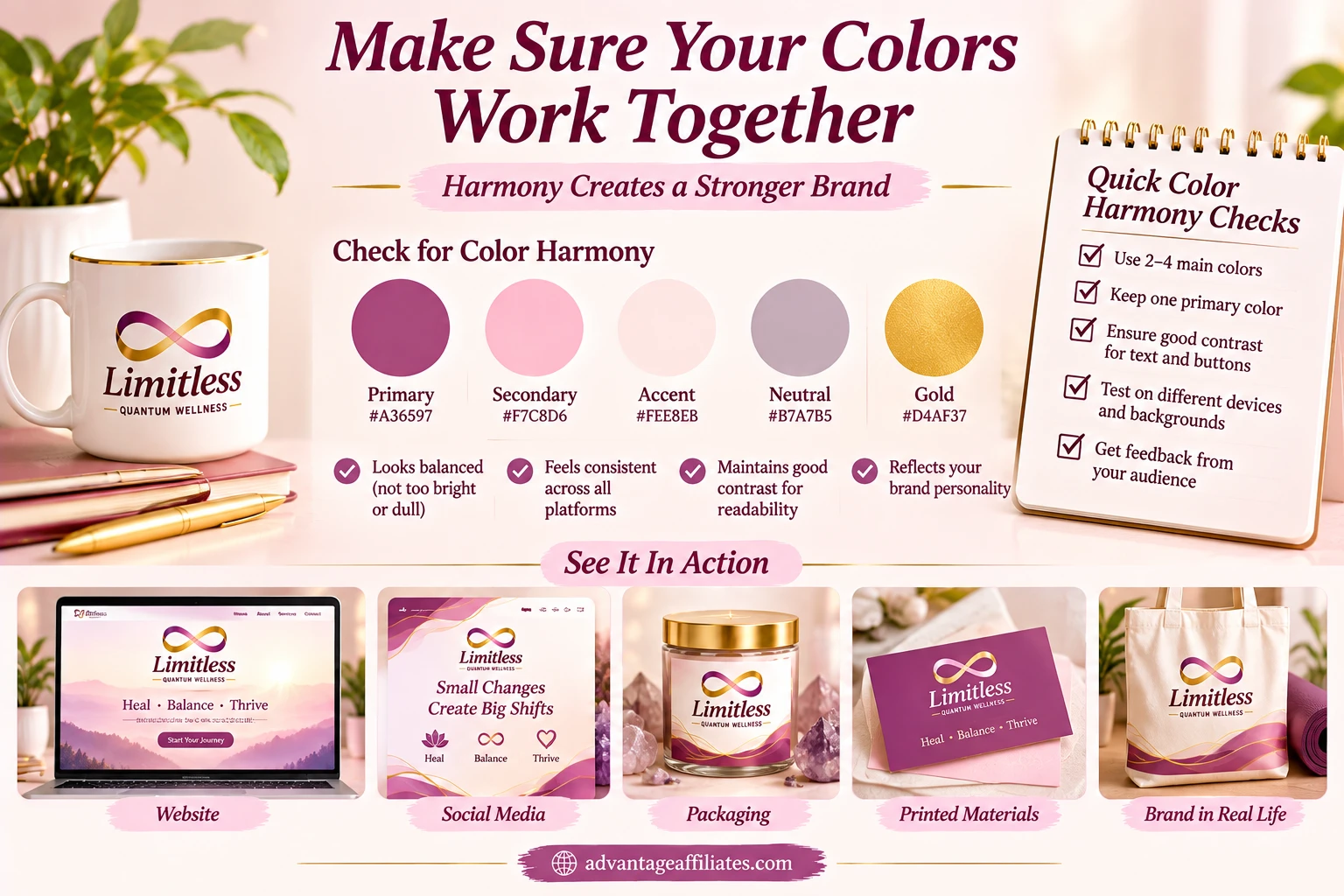
A color may look beautiful on its own and still clash with the rest of your palette. Test your colors together, not only as individual swatches.
Try:
- Placing your primary and secondary colors side by side
- Checking whether your accent color stands out without overpowering everything
- Using light colors for backgrounds and darker colors for text where appropriate
- Making sure buttons and links are easy to notice
- Viewing the palette on both light and dark backgrounds
If the palette feels noisy, remove a color or adjust the shade. Simple is often stronger.
7. Check Readability and Color Contrast
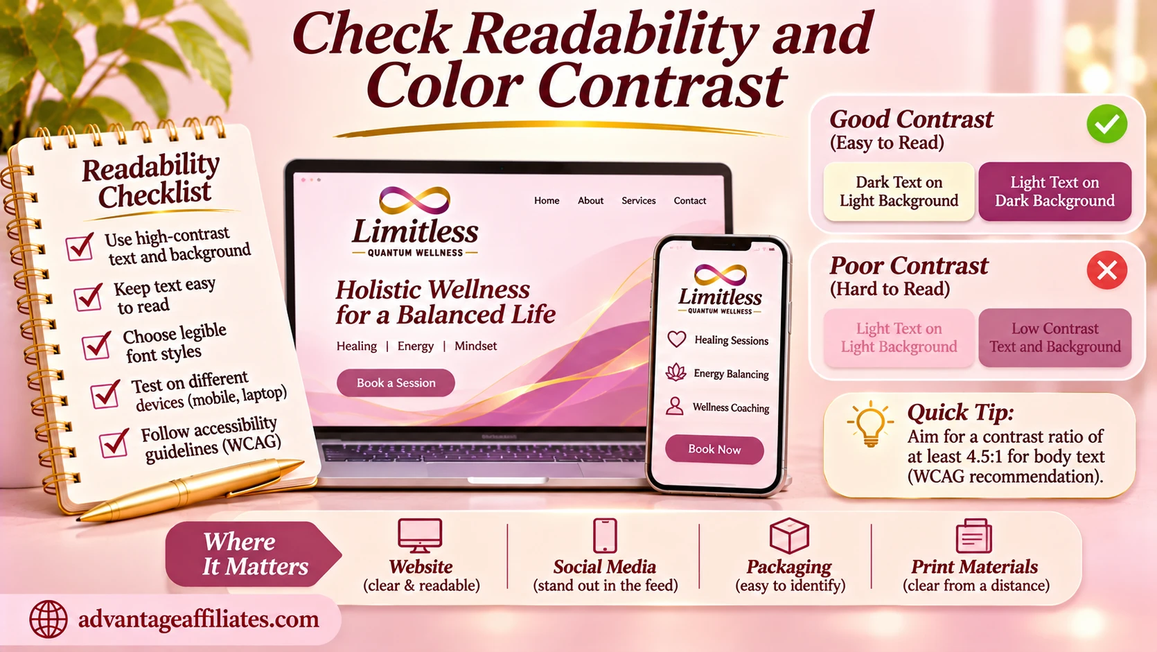
Beautiful branding is not helpful if people struggle to read it. Check your text against its background, especially for website buttons, captions, headings, and small text.
Avoid combinations where the text and background are too similar in brightness—for example, pale pink text on a cream background. It may look delicate in a design preview but become difficult to read on a phone.
Use the WebAIM Contrast Checker to test text and background combinations. Accessibility checks are especially important for small text and essential information. For more ideas on building a palette, see Shopify’s guide to choosing brand colors.
8. Test Your Brand Colors in Real Life Before Finalizing

Don’t decide based on a palette image alone. Put your colors to work in a few quick mockups.
Try your palette on:
- Your website header and a call-to-action button
- A Facebook or Instagram post
- A business card
- A product label, package, or service graphic
- A simple flyer
Step back and look at them together. Does it feel like the same business? Can you read everything? Does your primary color stand out? Does the palette still look good when viewed on a phone?
Testing now can save you from changing your branding later.
9. Save Your Exact Color Codes and Use Them Consistently
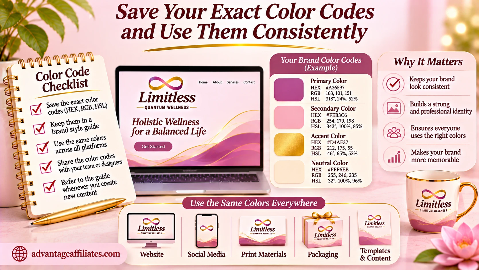
Once you are happy with your palette, record the exact color values—especially HEX codes for digital use. Don’t rely on memory or screenshots.
Create a simple brand-color reference that includes:
- Color name
- Color swatch
- HEX code
- Where the color should be used (primary, secondary, accent, background, text)
Then use the same palette across your website, social media, emails, presentations, and printed materials. Consistency helps your audience recognize your brand over time.
10. Review Your Palette as a Customer Would
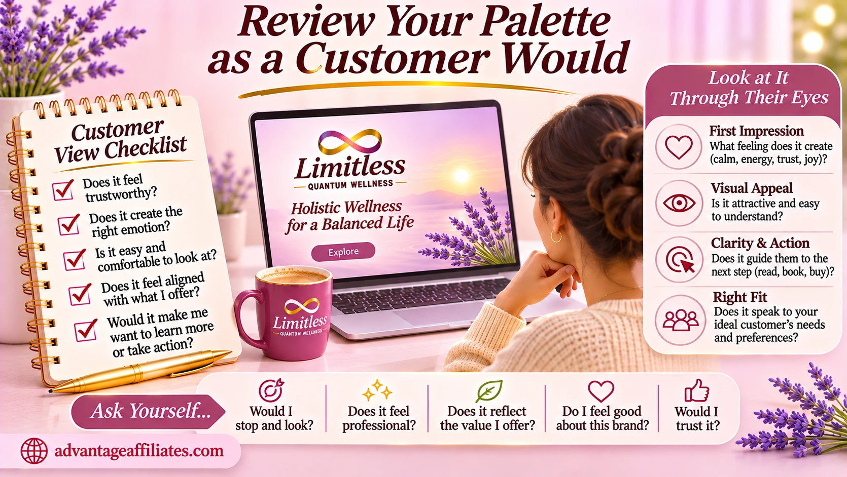
Before calling your palette finished, look at your business from the outside.
Ask:
- Do these colors reflect my brand personality?
- Will my ideal customers find the look appealing and appropriate?
- Is my brand easy to recognize?
- Can people read my text and see important buttons?
- Do my website and social posts look like they belong to the same business?
- Am I choosing these colors intentionally—or just because I like them today?
If you can answer these questions confidently, you’re on the right track.
Final Thoughts: Your Brand Colors Should Have a Purpose
Choosing brand colors doesn’t have to be complicated. Start with your personality, think about your audience, look at the competition, choose a primary color, build a small palette, test readability, and then use your colors consistently.
The goal isn’t to have the prettiest palette on Pinterest. The goal is to create a visual identity that feels like your business, connects with the right people, and becomes easier to recognize every time they see it.
Want to understand why your color choices matter so much? Read our guide to the importance of brand colors and learn how your palette can help make your business memorable.
Not sure what colors fit your brand personality? Take the free Brand Personality Quiz and get your personalized Brand Style Report.
Frequently Asked Questions
How many colors should a small business use in its brand palette?
A good starting point is three to five colors: one primary, one or two supporting colors, an accent, and a neutral. You can keep the palette smaller if that works for your brand.
Should I choose brand colors based on color psychology?
Color associations can be helpful inspiration, but they aren’t universal rules. Consider your brand personality, audience, culture, context, and the way colors work together.
Can I change my brand colors later?
Yes. If your palette no longer represents your business or is difficult to use consistently, a thoughtful update may help. Avoid changing colors simply because you’re bored or a new trend appears.
How do I know if my brand colors look professional?
Test them on real brand materials, make sure combinations are readable, and check that your website, social graphics, and other materials feel consistent and intentional.
What should I do after choosing my brand colors?
Save your exact color codes, create a simple reference guide, and use your palette consistently across all your brand touchpoints.

