While creating a website, we all want to create a beautiful website, so are there any matrix which needs follow to create a beautiful website?

No doubt, beautiful is a subjective term, and everyone has a different perspective on the term beautiful. Beauty can be different for different persons, it can be a personal choice. We all create things differently, and we all have our own ways to create or do things. Still, there are certain definite criteria that can be applied while creating a blog, a post, or a website.
So what are the things that we must consider for creating a beautiful website?
- Who are you building a website for?
- Website aesthetics
- Different types of layouts
- What to put after your content
Who are you building a website for?
The first and the foremost important thing while creating a website is to ask for who are you building a website for. You can choose from the following options and choose the order according to your viewpoint.
- You
- Your Audience
- Search Engines(Google, Bing, Yahoo, etc.)
Now you can choose any sequence it can be search engines, audience and you and so on. For me or for most of the content creators, it’s always been their audience. There should be no doubt, that whatever content we create and in whichever form it is like a blog, Youtube Video, Podcast, and so on, the priority is always the audience.
The next two options can be different according to your preferences. But when you create useful content, solving their problem, and giving them a specific solution, readers usually like it. And as per my observation, if a blog post has good views, Google ranks it better. SEO plays a great role in it, as we all know, we can use specific SEO techniques, so that our content gets more views. And more views means good rankings in the search engines.
Website Aesthetics
Website aesthetics play a huge role to make a website beautiful. A website should be easy on the eye, simple, and content-rich site. While choosing colours it is important to choose according to the niche. For example, a website relating to environment use Green as their main colour. Colours have their own psychology and we must remember the impact colours can leave on the readers. A website on meditation should have soothing colours instead of bright colours like red.
Website aesthetics and usability should be equally coordinated while creating a website. A poorly designed website can ruin even a good aesthetically created website. For example, a website with poor navigation, or very small and unreadable font, badly placed call to actions, etc. can leave a bad impression.
Today when you have just a few seconds to grab the readers attention, it’s important to think from the reader’s point of view.
Different types of layouts
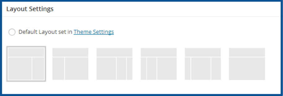
According to the theme, the layout of a blog post may differ but one of the best WordPress theme Generatepress offers you six layouts to form your blog post. It has both paid and free version.
- Sidebar/Content
- Content/Sidebar
- Content(no Sidebar)
- Sidebar/Content/Sidebar
- Sidebar/Sidebar/Content
- Content/Sidebar/Sidebar

Among all of these layouts, Content/Sidebar is the most popular and you will see on the majority of the websites.
It has also a scientific reason, our brains are trained to read from left to right, so if you want your reader pay more attention to the content than the distracting things in the sidebar, it’s best to use content/sidebar or content(no sidebar) layout.
Most of the times, the sidebar is used to place some ads, which can easily distract a reader and lose concentration. It is important to create a distraction-free reading space to your readers.
Some of the best examples of distraction websites are:
What to put after your content?
After you finish your post or an article, it is important to guide your reader to a certain action. If you don’t guide them to take action, readers will leave the blog without navigating your site.
That’s why it is important to place a CTA (call to action) at the end of the blog post. There can be many kinds of CTAs like anchor text CTA, button and so on.
You can also ask readers to take various actions like click to read a particular blog post, visit an affiliate link like Amazon, sign in for email list, CTA for buying some products on the website or just to leave a comment on your post.
Conclusion:
Creating a beautiful website consists of many components, of which few we discussed in this post. Beauty can be a subjective word and differ from person to person.
Irrespective of it, if your site doesn’t provide quality content, it will be really difficult to get his attention. Today people want information and that’s why they search the internet. They want to know or learn something or they might be finding some solution to their problem. If the content is not useful, it will not rank on the search engines. Search engines prefer content that is useful for readers.
Apart from quality content, website aesthetics is equally important. If the site is not good on the eyes, it will be difficult to retain the visitors. If we take the same example of a meditation site, where you are discussing a meditation, serenity you need to create a peaceful environment. If you use bright colours like red, the user experience will not be good.
Likewise, for a website dedicated to the environment, you will always find soothing colours like green or pastel shades.
CTAs are very important, as it guides readers to take a desirable action. If you want the reader to buy some product on your website, it is important to create a smooth funnel that will guide the reader through the process seamlessly.
Also, you can guide them to another useful resource on your own site or to another website through anchor text. It is not always important to put big CTA’s to grab their attention.
I hope this post is helpful and offered some hints on creating a beautiful website. I would like to share your opinion on what do you think about a beautiful website? According to you, what is a beautiful website?
And if you want to create your own website, I can give you a wesbite+hosting+training for free. Join me here
If you have any questions or suggestions, pl let me know in the comments below:)

