In this series of How To Make A Beautiful Website, we are discussing different elements that can help to improve the overall look and conversion of a website. We have already discussed the aesthetics part of a website, but do you know that typography and colours can help with better conversion? Many studies have proved that with better colour and typography, conversion rates go up drastically. So let’s find out what typography is
Typography in a Website:
Typography simply means, “the design of the writing in a piece of printing or on a computer screen” according to the Cambridge dictionary.
According to Wikipedia, “Typography is the art and technique of arranging type to make written language legible, readable and appealing when displayed. The arrangement of type involves selecting typefaces, point sizes, line lengths, line-spacing (leading), and letter-spacing (tracking), and adjusting the space between pairs of letters (kerning).”
A quick Google search shows that there are more than 550,000 fonts that are available today but the most common and popular font families are Serif and Sans Serif.
Serif fonts can be described as having a decorative stroke, giving a more of an old schooled feel. Many popular websites use Serif font like the Wall Street Journal, Huffington.

As you can see the decorative strokes in the Serif font as against the Sans Serif, which is very simple and clear font.
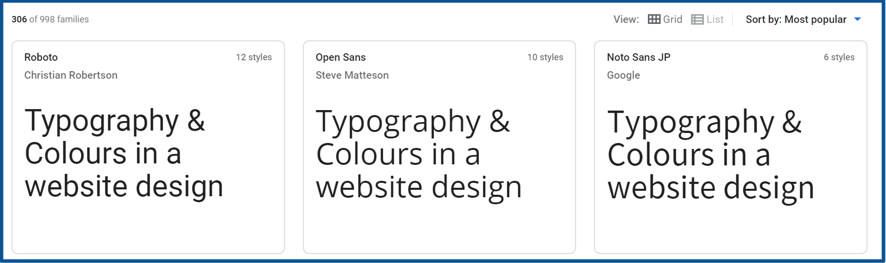
Above screenshot is of Sans Serif fonts, it has more than 900 font families in it, Roboto, Open Sans, Noto Sans JP being the most popular. As you can see there are no decorative strokes in the fonts and it’s more of a clean, clean and modern look.
Google has a great resource where you can try different fonts, so if you want to check different fonts before applying to your website check out here.
Choosing typography also depends upon the niche, for example, if a website is about kids, you need to choose a different font like the handwritten font and so on.
Font size also plays an important role, it should be readable to your audience. While choosing font size, it is important to know about your readers, age, and other demographics.
The Psychology of Colours:
Colours are very important in our lives and play a major role in our emotional status. There are a lot of studies clearly showing the connection between colour and emotions. Proponents of colour psychology believe you can use the theory to trigger particular behaviours in the customer.
According to Wikipedia, “This perception of colour derives from the stimulation of photoreceptor cells (in particular cone cells in the human eye and other vertebrate eyes) by electromagnetic radiation (in the visible spectrum in the case of humans).”
Colour psychology is the study of hues, and it certainly helps with understanding our audience. It is important to choose a colour according to the subject or a niche.
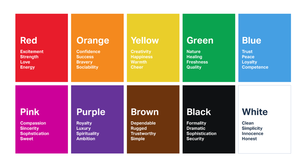
The above image shows general emotions created by a specific colour. It can be different demographically but if we look at Fortune 500 companies logo, we can see that these companies follow a specific trend of colour.
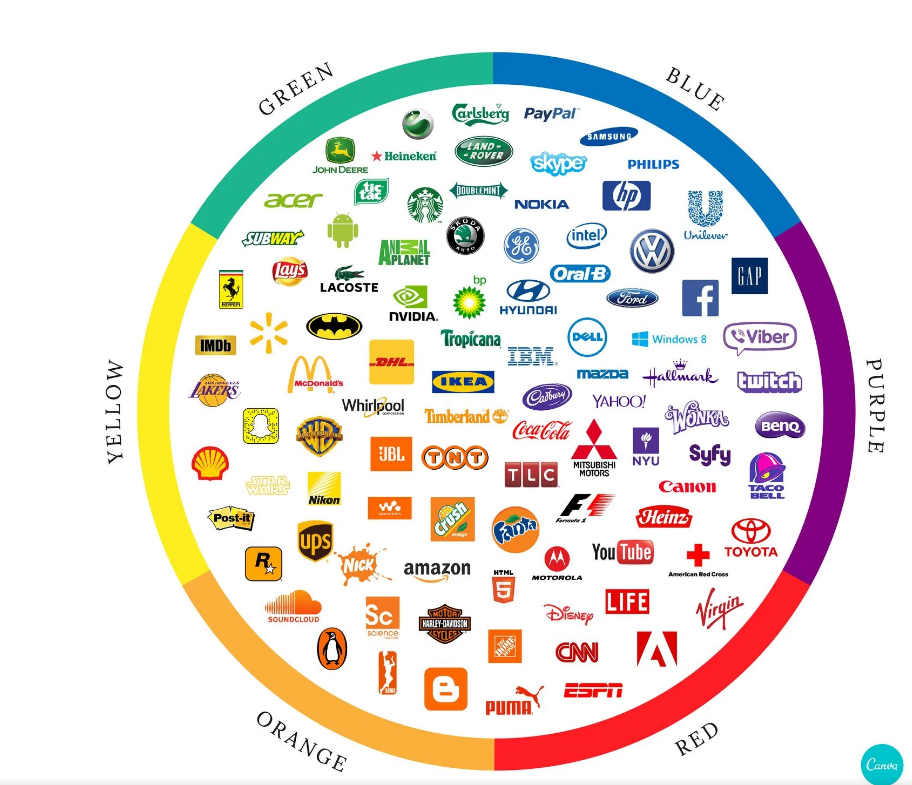
Image source: Canva
Fortune 500 companies. Here we noticed one prominent trend. Blue is by far the most popular choice of logo colour for these companies.
For instance, they found that blue is used in over 75% of credit card brand logos, and 20% of fast-food brand logos. Red, meanwhile, is found in 0% of apparel logos—but over 60% of retail brands.
Research shows that colour and light can affect our mood, heart rate, sleep and even our well-being and that’s why it is important to choose a colour according to your niche.
We can easily figure out why blue logos are such popular as it denotes a very sophisticated hue, an inoffensive colour. So the companies that intend to convey security say, Tech, Finance, Insurance, Health, blue is a great choice.
Red, on the other hand, is a bolder choice for a brand. Yet it came in as the second-most popular choice. In the Fortune 500, there’s a clear link between the Food and Retail industries and a red logo.
Things To be remembered while creating a logo:
The logo is a visual recall of a product or service so it’s important to choose the colours and font very carefully. Factors like culture, gender and age also needs to be taken into account while creating a logo and a website.
A great resource by Canva, can help greatly to create a beautiful colour palette.
Website is an online presence of your brand, product and service and to enhance the aesthetics of any website colours and fonts play a major role.
There are some companies that update their logos every 5 years but some companies prefer to have a steady logo and font over the years.
While creating a logo, it is important to do a proper research about the product and its users. Once it is clear, the next things become easy.
Logo type and colour scheme need to be chosen very carefully, 90% of snap judgements made about products can be based on colour alone. No surprise, purchasing intent is greatly affected by colours.
Conclusion:
Colours along with good font can help greatly to improve the look of any website. Colours are closely related to emotions and so we should use colours very carefully.
Particular colours can be used to convey a specific message to readers and thus help to instantly connect with the website. It certainly helps with improving the conversion.
Font, on the other hand, give you the option to choose from a wide variety. Fonts should be readable, and again which is compatible with your niche.
We started the article with my previous blog, discussing for whom we are creating a website? Definitely for our readers. It’s important to write for them and not for search engines, and if we provide useful information which helps them solve their problems, definitely they will convert better.
The most important thing is the reader should relate itself to the content or the website, otherwise, it will not return again and increase the bounce rate.
I would really like to know how do you choose fonts and colours for your website. Pl comment below and let me know:)
