Hey, I have a question for you, which websites attract you most, or which is your most frequently visited websites? And also tell me which websites you leave within a few seconds?
I think with great content, the aesthetics of the website plays a huge role in keeping the visitor on your site. The typography of the website, like font, size, and color plays a major role in the aesthetics of a website.
Do you know that a particular font can have a positive or negative impact on your reader and as a blogger, content creators it’s up to you to provide them reading hygiene. I really like this word “reading Hygiene”.
What is reading hygiene? providing our reader with the best reading experience. Intrusive Pop-ups, cluttered with too many ads on website, distracts and create distaste in readers.
The first thing we need to think about is for whom we are creating content, We all take great effort to create content for our readers, to provide them valuable information and help them to solve their problems. We also take care that our content is entertaining and easy to read and digest to our readers, right?
But do you know that fonts, color, and size of fonts can help your reader to spend more time on your website? A good layout website makes your reader feel good.
Science and Psychology Behind Typography
Psychologist Kevin Larson and his study at MIT, is a remarkable study and it shows how fonts can affect the psychology of the readers. It actually proves that readers felt bad while reading the poorly designed layouts.
The Aesthetics of Reading by Kevin Larson. It’s a PDF, which has some great points, which we may need to apply.
“Researchers concluded that well-designed reading environments don’t necessarily help you understand what you are reading better…But they do make you feel good, causing you to feel inspired and more like to take action” – Jay.
Can it affect conversion or sale?
Typography can greatly affect your conversions and sales. to a great extent, it also depends on the CTA – Call to Action.
You have written a great piece of content, very useful and informative, but with poor typography, say the font is too small to read, or colour of fonts, which is irrelevant to your niche, definitely affect your conversions. If you CTA are not strong enough, may resist them from taking the action.
Psychology of Colours
As a web designer and a content creator, we must be aware of the fact that colors hugely affects the psychology of the readers.
There is also a neurological aspect of colors, which affect certain parts of the brain and provoke them to take action. Colors create a certain state of mind in the readers, so be sure you choose the right color for your website, which is relevant to the niche and have a positive impact on the readers.
Let’s see some popular colors and which emotions they emit:
Blue :
Blue is the colour of Water and cloudless sky, blue in all around us in some or the other form. Blue is very popular and you will find many popular websites like Amazon, Facebok use Blue as their major color, as it represents authority, liability, honesty, and reliability.
Positive associations:
Rest
Authority
Loyalty
Honesty
Responsibility
Openness
Self-control
Reality
Ambition
Blue often used to invoke a fresh and calm atmosphere. In personal characters, blue stands for creativity, sensitivity, and open-mindedness. A great sense of responsibility can be an attribute of a blue colour.
Yellow:
Yellow is a bright, cheerful colour of the sun and the flowers.
Positive associations:
Optimism
Cheer
Creativity
Willingness to work
Informative
Force
Rational
Balance
Alertnes
On a personal level, a person who uses more yellow can be very active, creative and a communicative person.
The associations with alertness and vigor ensure that the color yellow lends itself well to draw attention to something, action groups such as Amnesty International are extremely beneficial, their choice for the color yellow is therefore not surprising.
Yellow Websites exudes positivity and cheerfulness, Mcdonald is one of the examples who uses yellow profoundly in their logo.

Green:
Green as we all know associates with environment and abundance.
Positive associations:
Health
Balance
Peace
Fruitful
Sportive
Environment
Modesty
Realistic
Persons who favour green are peaceful, down to earth, and modest. The color green is the soothing and balanced associations especially suitable for sites that deal with nature and the psyche.
Orange:
Orange represents the cheerfulness, the royal and national sports heroes. Orange evokes warmth and happiness. It is the combination of the physical energy of the color red with the cheerfulness of yellow.
Positive associations:
Adventurous
Active
Enthusiasm
Spirit
Buddhism
Cheer
Extrovert
Independent
People who prefer orange color, are optimistic, cheerful and helpful, uplifting for their environment, and motivating.
so you see, how different colors can help to create and invoke a particular emotion and feelings in the readers. It is also important to have a relevant color to your niche like Green is more appropriate to environmental niches than for an aggressive niche like sports.
For a self-improvement niche, soothing colours are more appropriate than bright colours like Red and Yellow.
Also fonts play a huge role to build a particular image around the brand. For instance, if a financial company uses font “Comic Sans” you would probably remark it as unprofessional, but if it changes its font to traditional Serif font, it creates a sense of trust.
Serif font is the most traditional font which invokes a feeling of trust, respectability, authority, and grandeur. Serif font creates a feeling of class and heritage, because of which you will find that it is used by many famous companies like Honda, Sony, Volvo in their logo.
In short, it means that the colours, shapes, and even the fonts need to work together and relate to each other in a harmonious way while displaying the unique values of the company. Even if you get the brand name, colours, and your logo perfectly right – the wrong font could destroy the credibility of your brand.
Typography is one of the major factors of the website, which can make or break a business, so it is important to choose the font very carefully.
Here is a Free Training on:
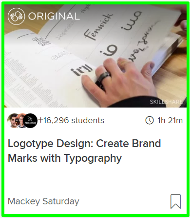
Logotype Design: Create Brand Marks with Typography
It’s a popular course on Skillshare, as you see it offers almost 1+ hour of training on Typography and Logo Making. I have gone through this video training, and I liked it.
Not only this, but you will also get 2 Months of Premium Membership Free, so you can check out other courses also.
It requires you to fill your credit card info, but the best part of Skillshare is that you can cancel your membership anytime.
They do not charge your card without letting you know:)
Hey Friends, I hope this discussion is helpful to you and would like to know which is your favorite font and colour for your blogs and content. Comment below if you have any questions or suggestions, I will be glad to guide you in the right direction.

